About the brand
Kuery is a social consulting and networking platform designed to help people to find experts for any assignment/problem in sectors or expertise that they are struggling with.
Logo explanation
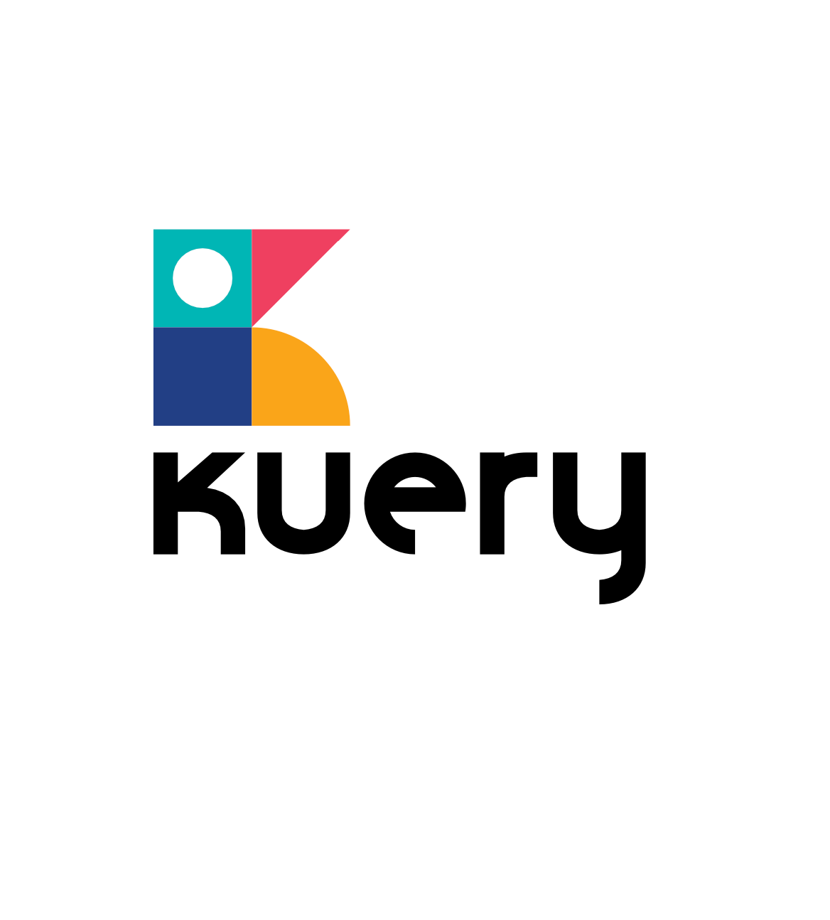
The logogram is built from 4 basic shapes that form the letter K (the initial letter of the brand). The chosen colors are to represent the brand itself, it communicates fun, young, and modern.
The 2 squares filled with the cool shade colors (teal and blue) and with the rigid shape of the square represent the raw talent that the target audience have or maybe they didn’t know.
The triangle and the quarter of a circle shape have a more bright color (yellow and red) to represent the target audience 's that they discovered or have polished.
The negative space of the circle is to represent Kuery as a people-based or people-service company because, without the people, Kuery means nothing.
